Table of Contents

PostUp is a new (fictional) startup that wants to make it easier for freelancers and remote workers to find great coffee shops, free spaces, and public spaces to do work from.
They’ve brought me on as the sole designer tasked with coming up with a solution and testing it out.
At it’s core the goal is to make it easier for remote workers to find great public places to work from.
PostUp specified that the solution must:
Be designed as a mobile app
Help users find places that already exist.
Charge a monthly fee to users in exchange for access to PostUp information.


There was also an interview with Chelsea, a freelance graphic designer in NY that worked remotely. Chelsea guided the interviewer through her process when deciding on a place to work.
I took note of the reasons behind her decisions as well as the things she pays attention to, so I could keep a list of problems to tackle.
Distance is important, maps in a city are good for visualization.
Business metric isn’t accurate; based off of food order times, not how crowded it is.
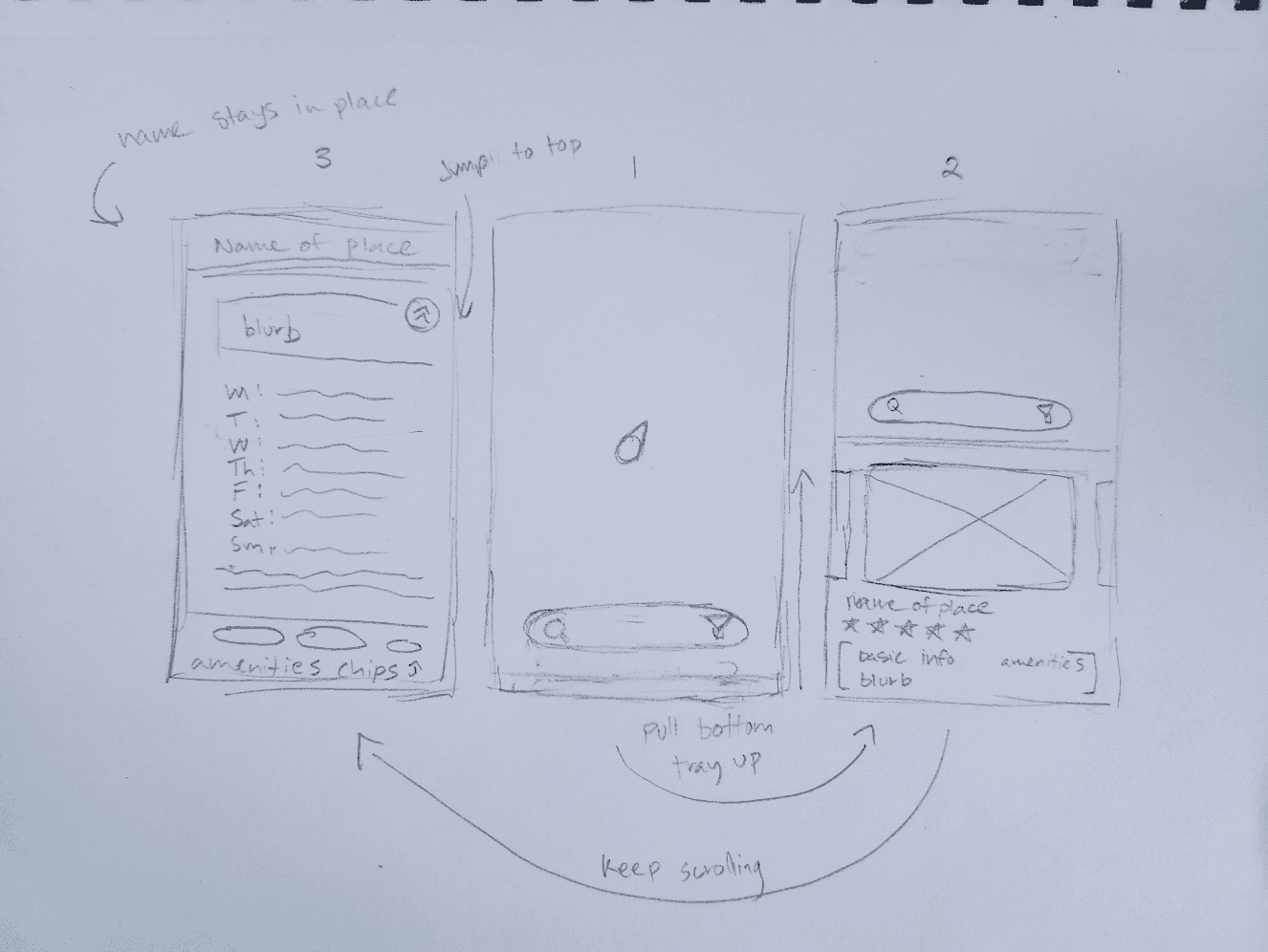
Initial Sketch
With all of that in mind, I drafted up a couple of solutions to see what felt best.
In the end, the one I went with was this one:
I conducted a solo lightning demo session to look at solutions that competitors have already produced to solve a problem similar to the one I’m trying to solve.
This helped me refine some of the ideas I had from the previous day, as well as give me some new ones.

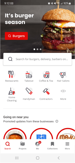
Yelp
Review, Social
My first pick was Yelp. I mainly use this app when I’m looking for new places to go.
I find that the information on the business is typically more accurate and it’s easier to get an idea of what a location is like.
Really good at helping users find what businesses are
List information has most common things to look for
Search function is deep and thorough
You have to make a search before knowing what’s in your area
It’s hard to gauge how far or where a business is, since search results are business first, location second.
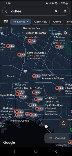
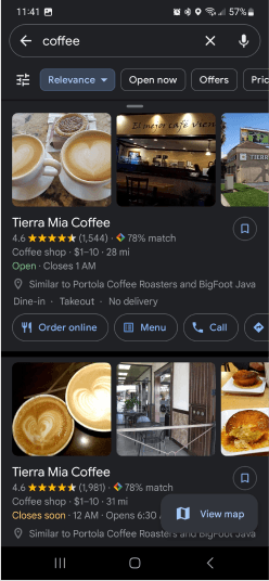
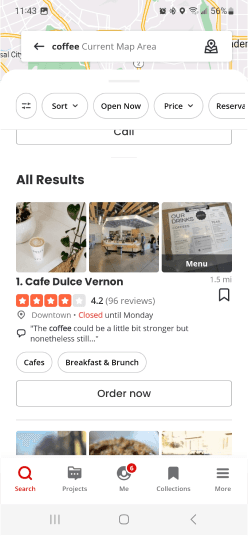
Google Maps
Navigation
Google Maps was an option I also took a look at. I mainly use this app for navigation purposes, but also when traveling to see what’s nearby me.
While lacking in business related information, Maps is really proficient in finding the great places themselves.
Really good at helping users find where businesses are
Map being prominent allows user to always be able to judge distances
Search function is lightweight and easy to use
Search results are location first, business second.
Business metrics can be ambiguous or vague.
Crazy 8's
I referred back to my Day 1 sketch, and picked what I felt would be the most important screen
Using the Crazy 8’s method, I drafted up a bunch of variations of that screen to see what kind of ideas I could come up with.
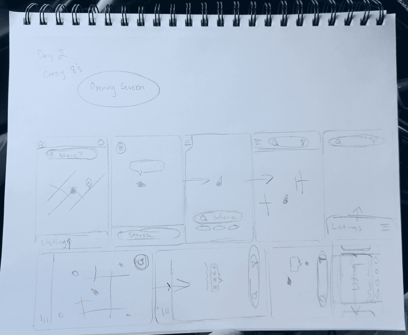
The Pick
I picked the sketch that spoke to me the most and drafted some screens that might’ve come before and after that screen in a user flow.
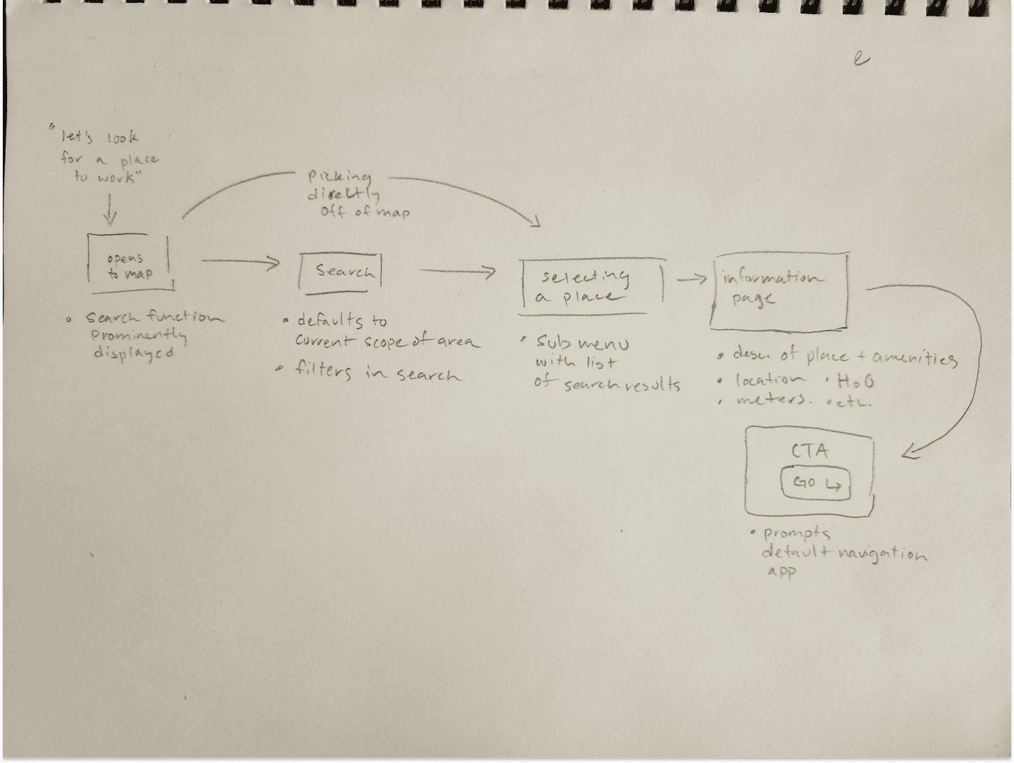
StoryBoarding
Using the partial flow I drafted the previous day, I fleshed it out and expanded on it to be something a bit more complete.
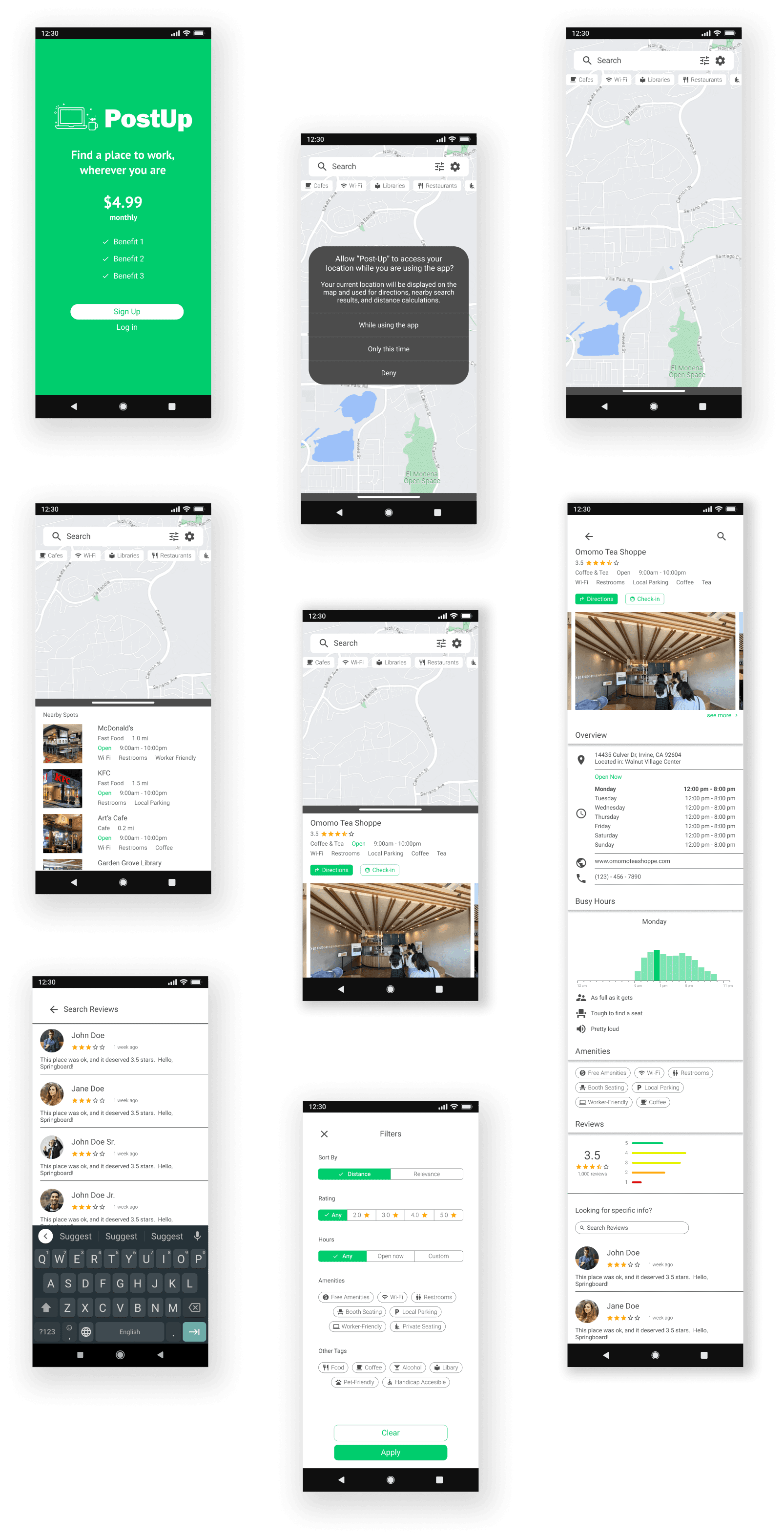
This lightweight, sketched wireframe contains the bare essentials for the core user flow: help a user find a great place to work.
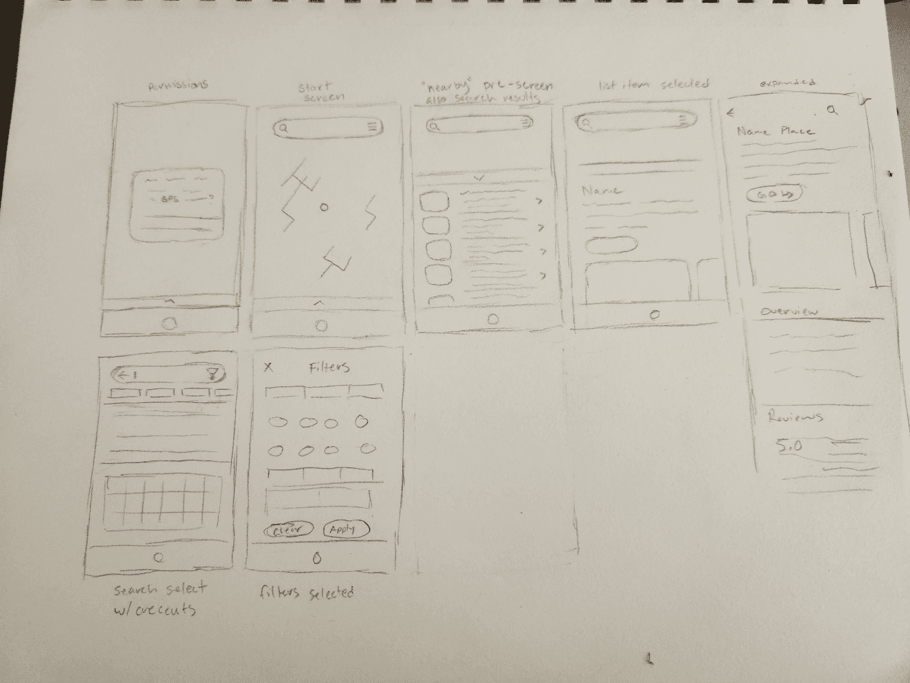
I kept the map as the opening screen, allowing users to gain their bearings and more easily judge distance.
I included a “Nearby” list to let users quickly find places near them, and a search + filter feature to help narrow down the traits that a user may look for.
With the sketched wireframes, I got to work on putting together screens for a (barely) functional prototype for the interviews I had planned for the next day.
Along the way I revised some of the screens so that they’d flow better.


The day has has come!
I had previously scheduled a set of five interviews with people from communities I’m in. I sat down with each of my interviewees over a video call, and had them think out loud while playing with the app.
I gave them a task or two as well, to see how a user would be able to learn and use the app in a short time.
Here’s what I learned:
Users were able to complete the task of finding a suitable place to work.
Users found the filters and tags helpful, albeit lacking (in variety).
Users were able to locate reviews, and appreciated being able to look for specific things in the reviews using the search.
Users noted that the app felt easy to pick up, and intuitive to use.
Users felt that there could be a bit more information in the compact view
The bottom tray (when minimized) doesn’t clue in the user on what it’s for